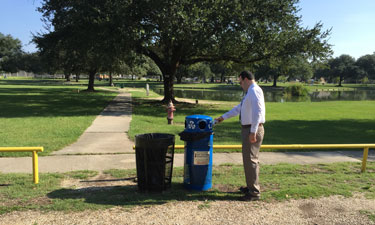
 A result of our “on-the-go” lifestyles is the increased consumption of beverage containers and other recyclables outside the home. In response to this trend, more communities are introducing recycling bins to parks and other public locations where these items are consumed. Besides capturing recyclables otherwise destined for the landfill, these communities are motivated by the potential of public-area recycling to reinforce the same behavior in the home and other settings, as well as the ability to project a positive community image to visitors.
Any park manager knows, however, that collecting recyclables is not simply a matter of setting out bins. Beyond capital and operational expenses, there is the significant challenge of getting people to use the bins properly. Cans and bottles can end up in the trash and worse, recycling bins can contain so much trash that recycling companies won’t accept the material. The take-away message for some is that people aren’t willing to recycle.
Research and the experiences of many communities indicate the opposite is true. Given the opportunity, most people are inclined to recycle. The larger lesson should be that recycling outcomes are aligned to predictable design and management inputs like any other facility operation.
While the 15-20 percent of people shown to have strong environmental beliefs will go out of their way to recycle an item correctly, multiple studies have demonstrated the key to getting most people to recycle is to remove the two greatest barriers that prevent them from doing so: confusion about what to recycle and lack of convenience.
Research conducted by Keep America Beautiful (KAB) in 2009 showed only 12 percent of surveyed public locations had infrastructure to recover recyclable items. This lack of recycling opportunities is reflected in a separate national survey KAB conducted in 2013, in which 92 percent of respondents said they recycle at home while only 19 percent indicated that they typically recycle in public parks.
Confusion over what and how to recycle is caused in part by the ever-increasing types of packaging and the tendency of each community to independently define what items will be accepted and how to visually identify a recycling bin versus a trash bin (e.g., color and signage). The result is that people have to constantly relearn what and how to recycle wherever they go.
This confusion is compounded by a human characteristic both obvious and widely underappreciated: discarding waste items is neither a priority, nor the primary focus of most people’s attention. This insight is critical to understanding and influencing whether a person correctly places an item in a recycling or trash bin.
Form Versus Function
Behavioral studies have demonstrated that waste receptacles must instantly communicate that there is a choice between “recycling” and “trash.” People must also know what items to place where. Failure at either of these two points risks trash and recycling bins being treated interchangeably. Every location has unique considerations that influence how people respond to waste receptacles, including aesthetic concerns, but research and experience point to a number of largely universal design factors that influence correct recycling:
“Twin the bin” — Separating recycling and trash bins from each other, even by a few feet, will increase the likelihood of cross contamination. The position of the bins to traffic flow will have a similar effect.
Color matters — Using different colors to distinguish recycling from trash makes clear at a casual glance that there is a choice. A University of Michigan study from 2012 showed that switching from identically colored recycling and trash bins to two different colors increased the recycling rate from 55 percent to 88 percent.
Clear, simple messaging — With peoples’ fleeting attention spans, less is better. Based on a 2009 recycling feasibility study KAB produced for the National Mall, the National Park Service labeled its recycling bins with a few bold words: “RECYCLE” and “BOTTLES and CANS,” along with a recycling symbol and images of cans and plastic bottles. KAB is currently conducting research to better understand how people respond to specific messages and graphics in different settings.
Restrictive lids — Smaller openings that require users to consciously navigate an item into the bin reduce the likelihood of them casually tossing an item into the first hole they see.
Consistency — While there is no national standard for coloring, wording or listing of acceptable items collected for recycling, facility managers can minimize confusion by harmonizing these factors within a facility or park and with other recycling programs in the surrounding community.
Download a KAB best-practices guide detailing these and other design tips for recycling in public spaces, and to learn about available infrastructure grants.
Alec Cooley is the Director, Recycling Programs, at Keep America Beautiful.

